America’s Test Kitchen’s Shop is the official storefront for our cookbooks, branded merchandise and exclusive sales with brands we've tested and love.
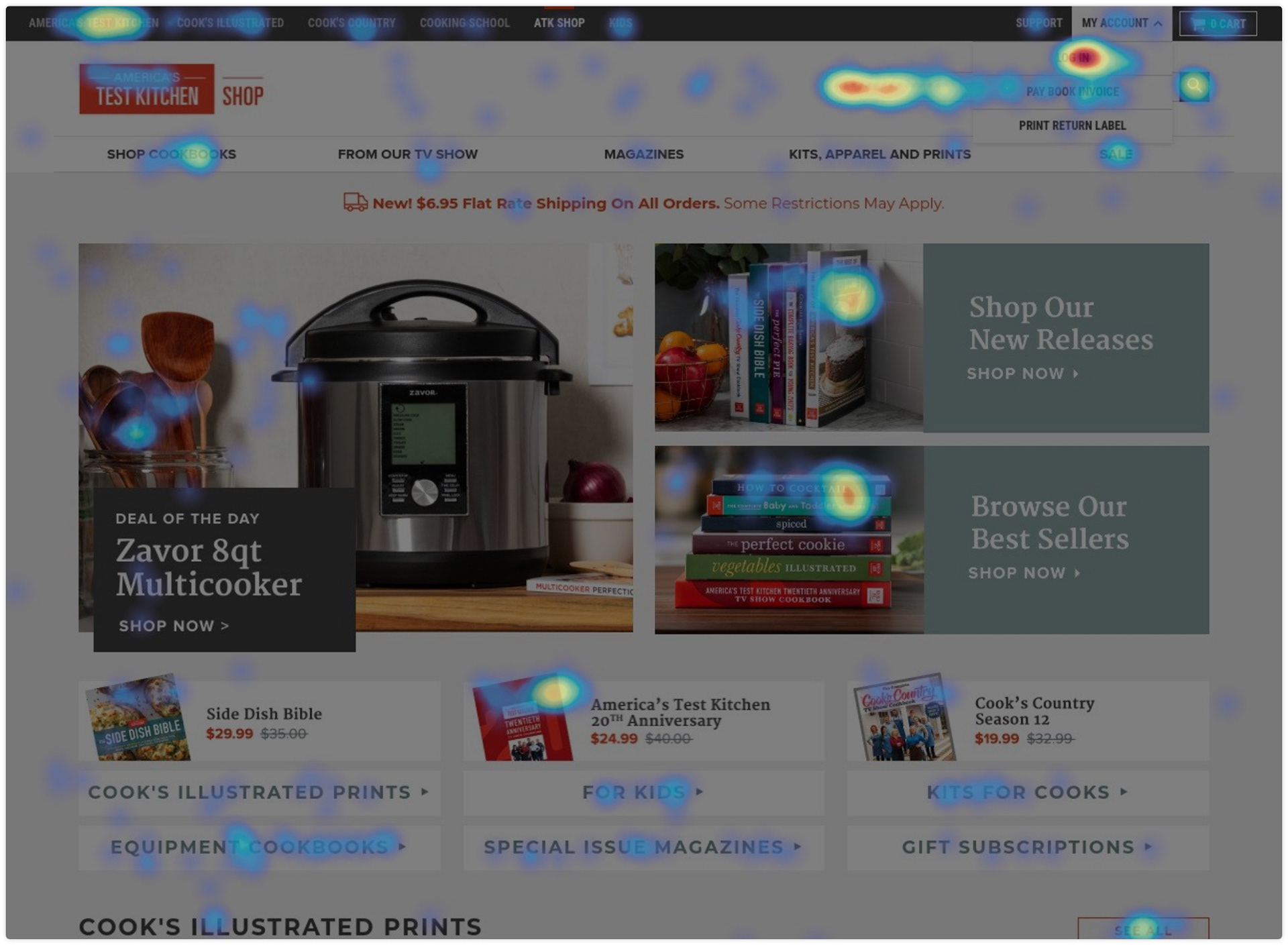
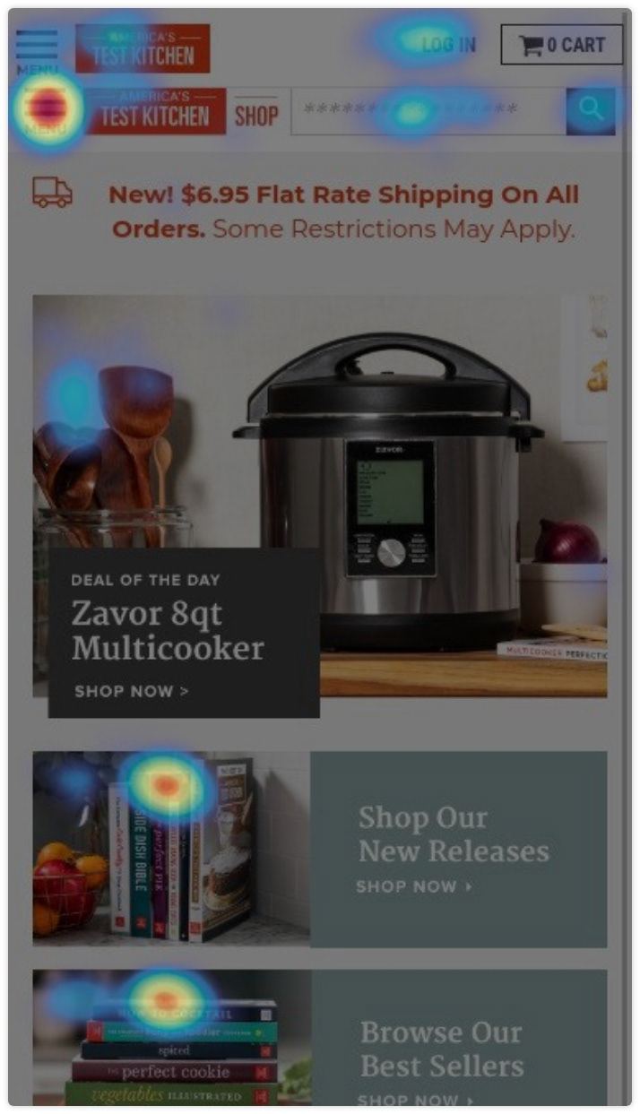
Our challenge was to design and build a shop homepage that is easy for the customer to navigate and also for the small team to update. We've moved shop platforms and redesigned pages a handful of times over the past few years, each new round bringing a cleaner more direct path to checkout while also providing a depth of information. Below are some examples of bigger changes.


HOLIDAY 2020
For our holiday 2020 campaign we really wanted to highlight one specific product each day and also move into a place where we were encouraging people who visited the homepage to browse.
For our holiday 2020 campaign we really wanted to highlight one specific product each day and also move into a place where we were encouraging people who visited the homepage to browse.


OLD PLATFORM
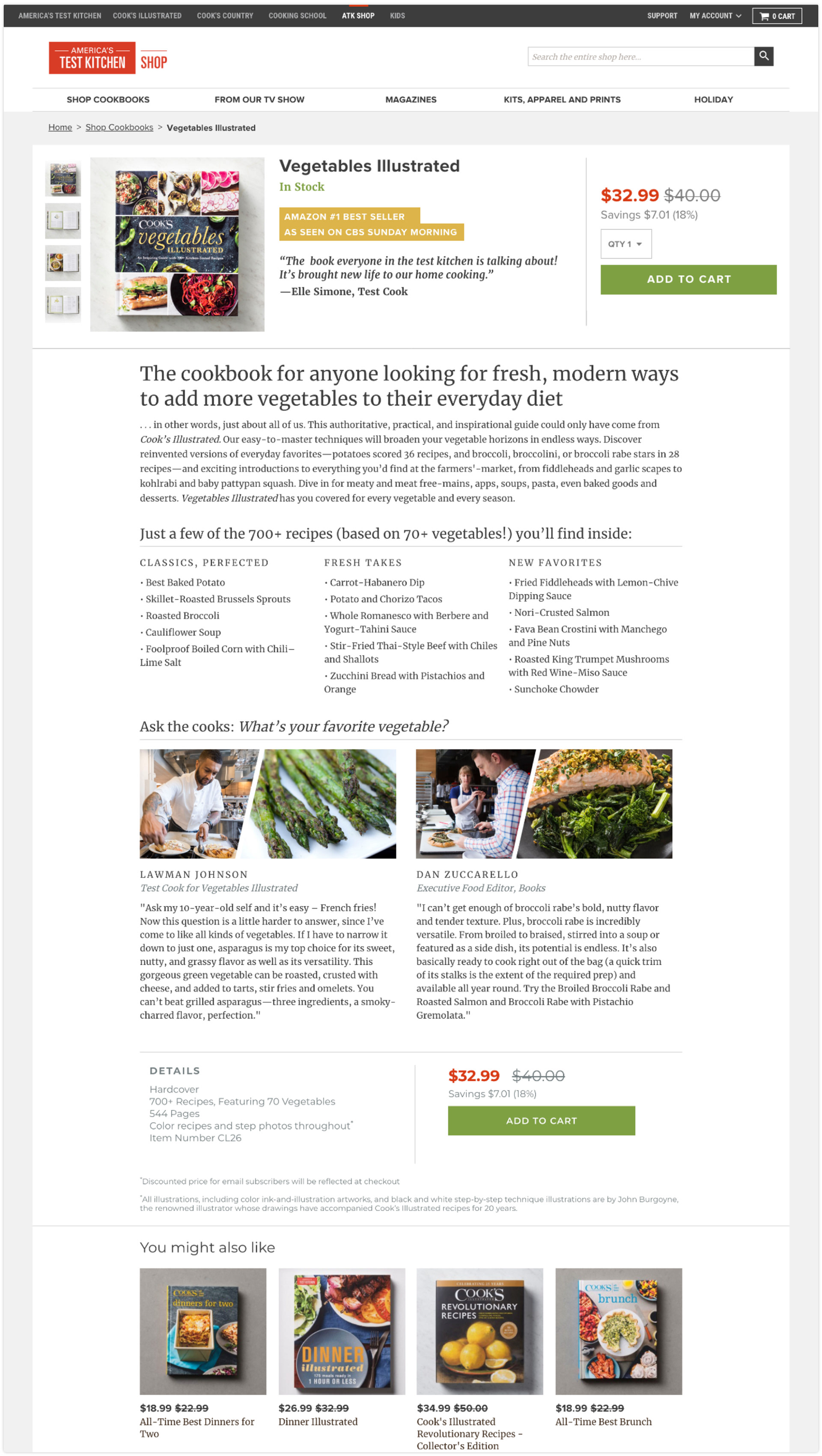
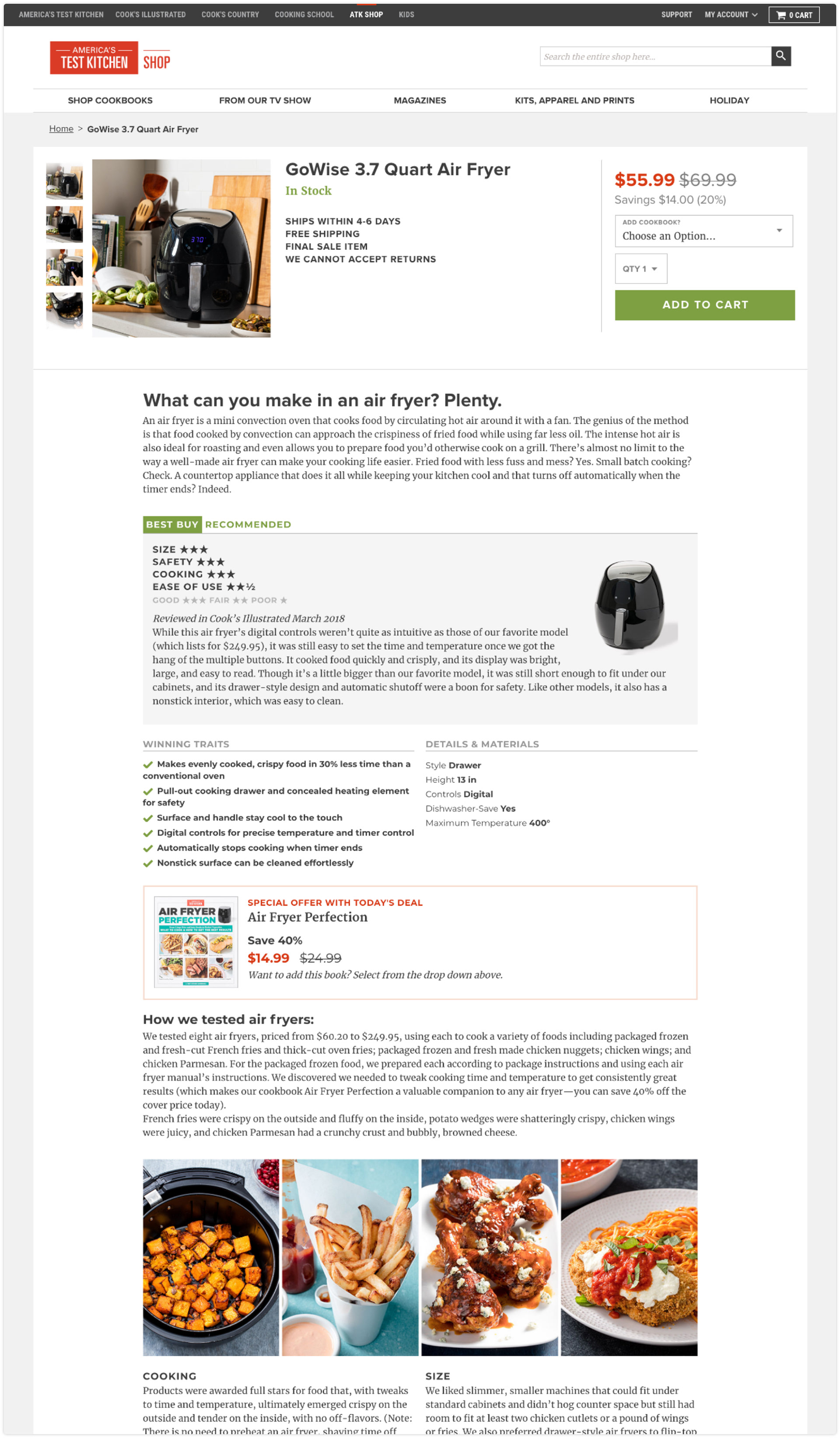
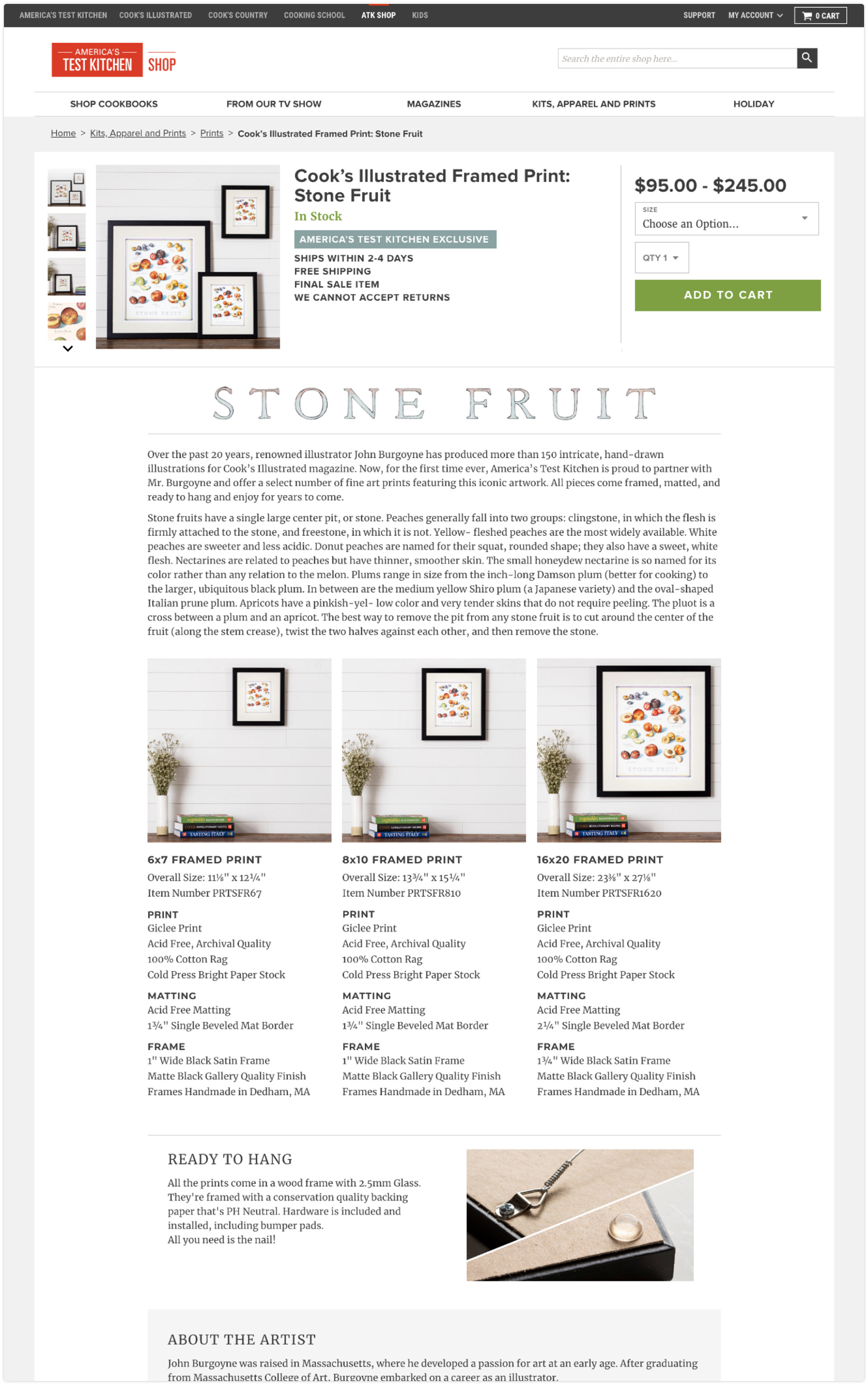
Before we moved onto our new platform, I was writing the html for all the pages I designed. These are reflected below:
Before we moved onto our new platform, I was writing the html for all the pages I designed. These are reflected below:


I use the program Hotjar to track our users typical paths to detail pages as well as to see where people were dropping off on any given page.
