I’ve touched most of the on-site marketing and join flows at America’s Test Kitchen in the past 4 years.
Here’s a small sample:
Here’s a small sample:
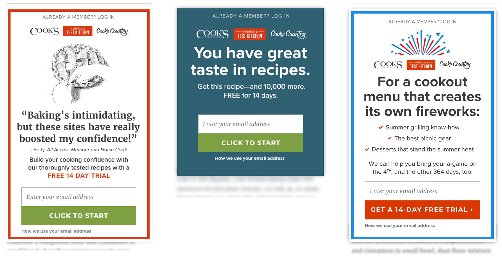
We’re constantly testing new paywalls at America's Test Kitchen. Here's a small sample of some recent tests:
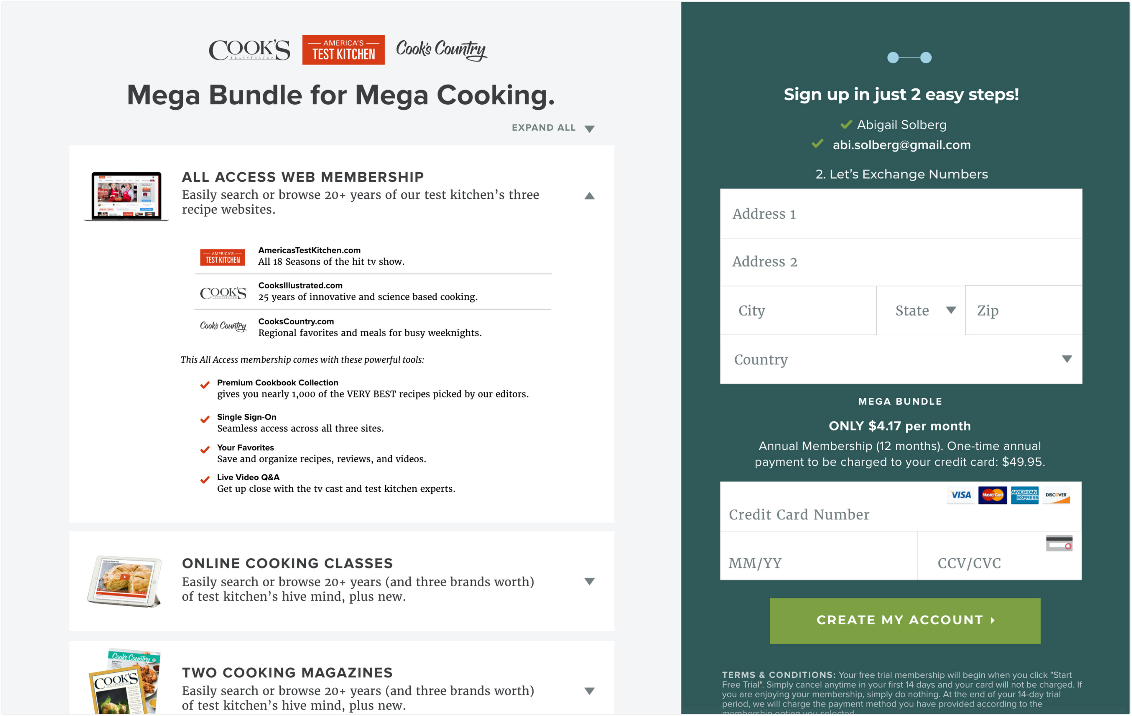
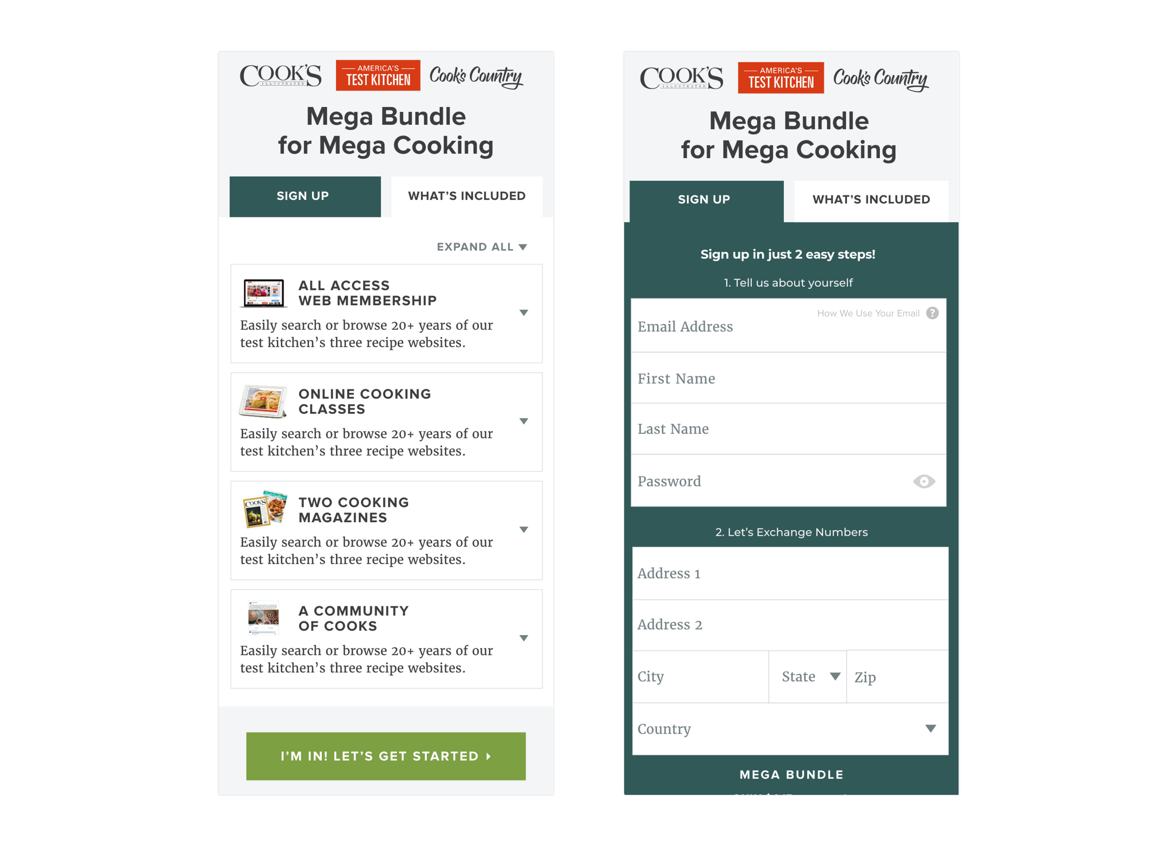
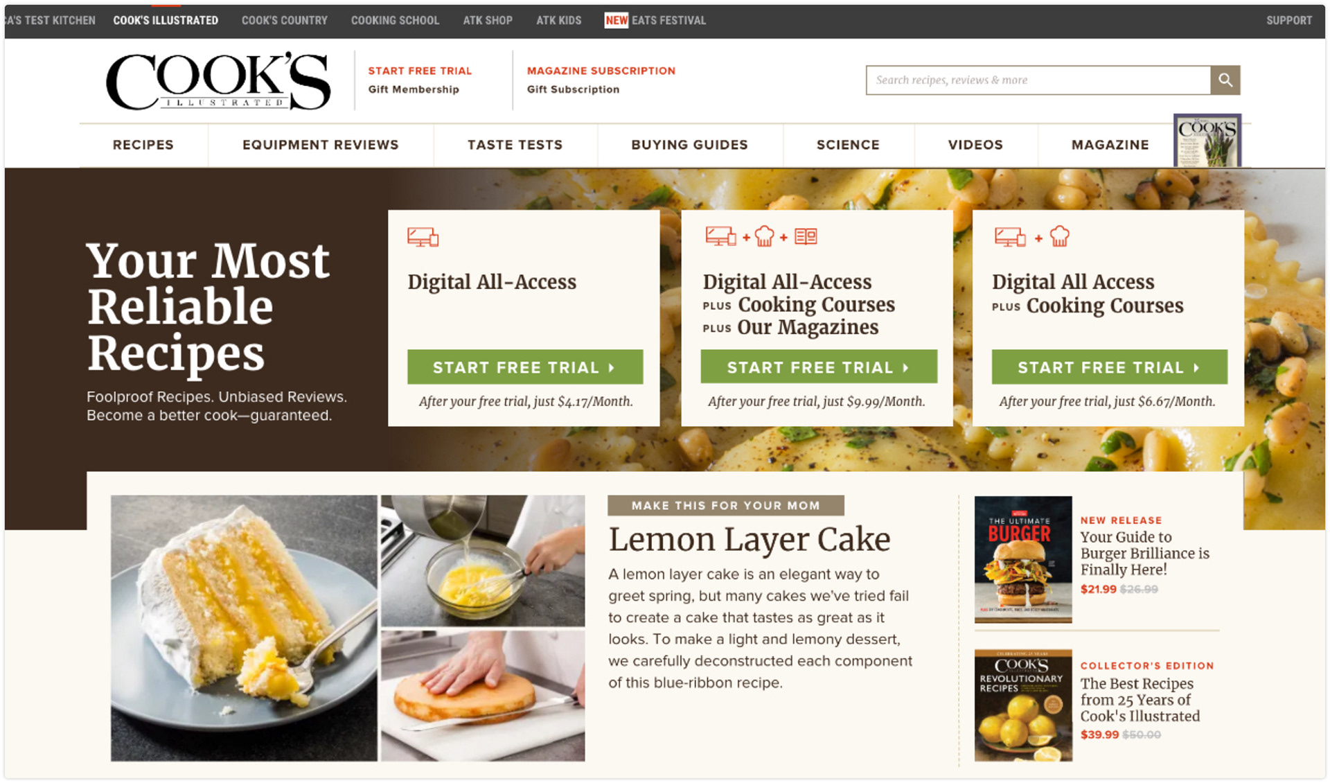
Our largest membership level includes website access, our online school, magazine subscriptions and more. With so much information, I needed to create a join flow that didn’t overwhelm anyone, but offered the option of accessing more details if they wanted them. This page can also be flexible in what it offers, simply by adding or removing membership items on the backend.

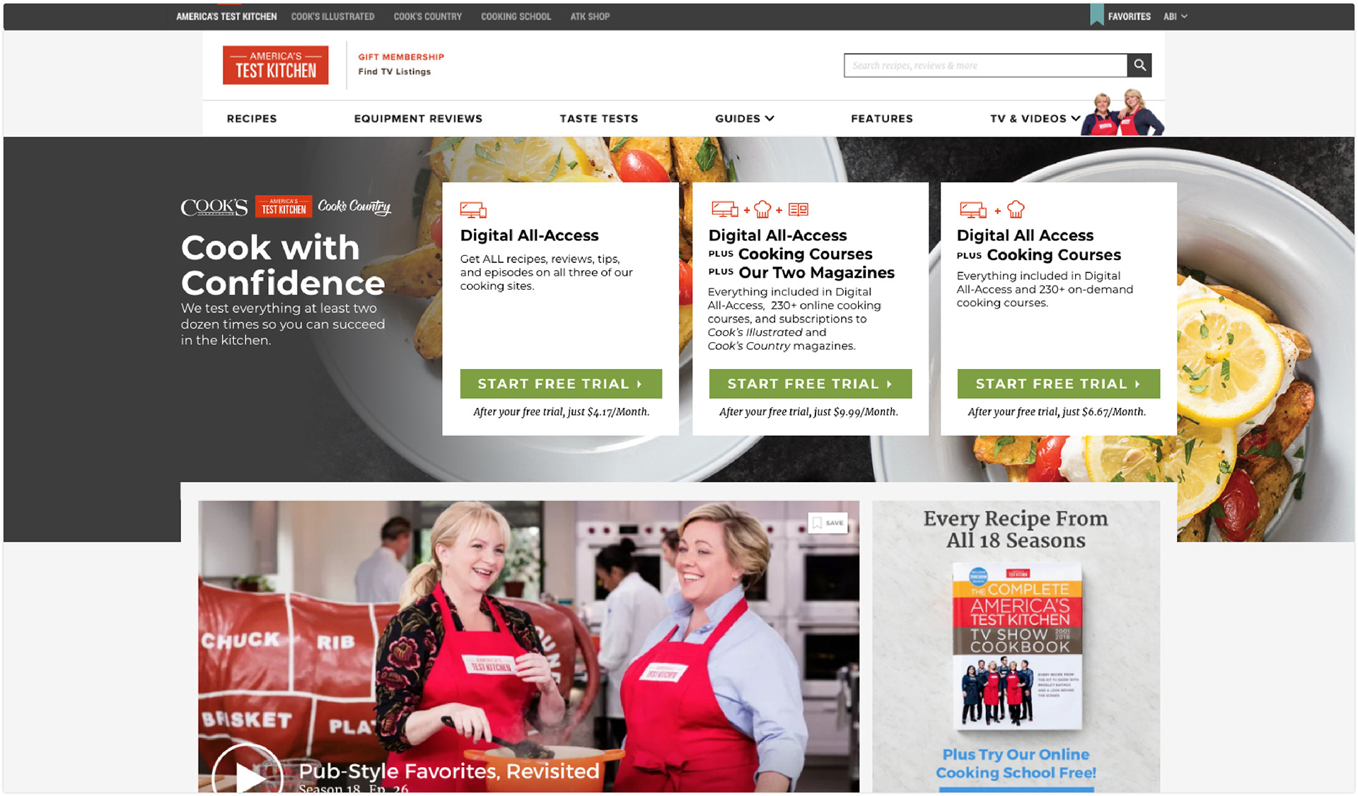
With so many ways to join America’s Test Kitchen, I was asked to create an adaptable top-of-page ad that could show the user three different membership options. By using icons, I was able to visually summarize each offer before the visitor reads the copy.

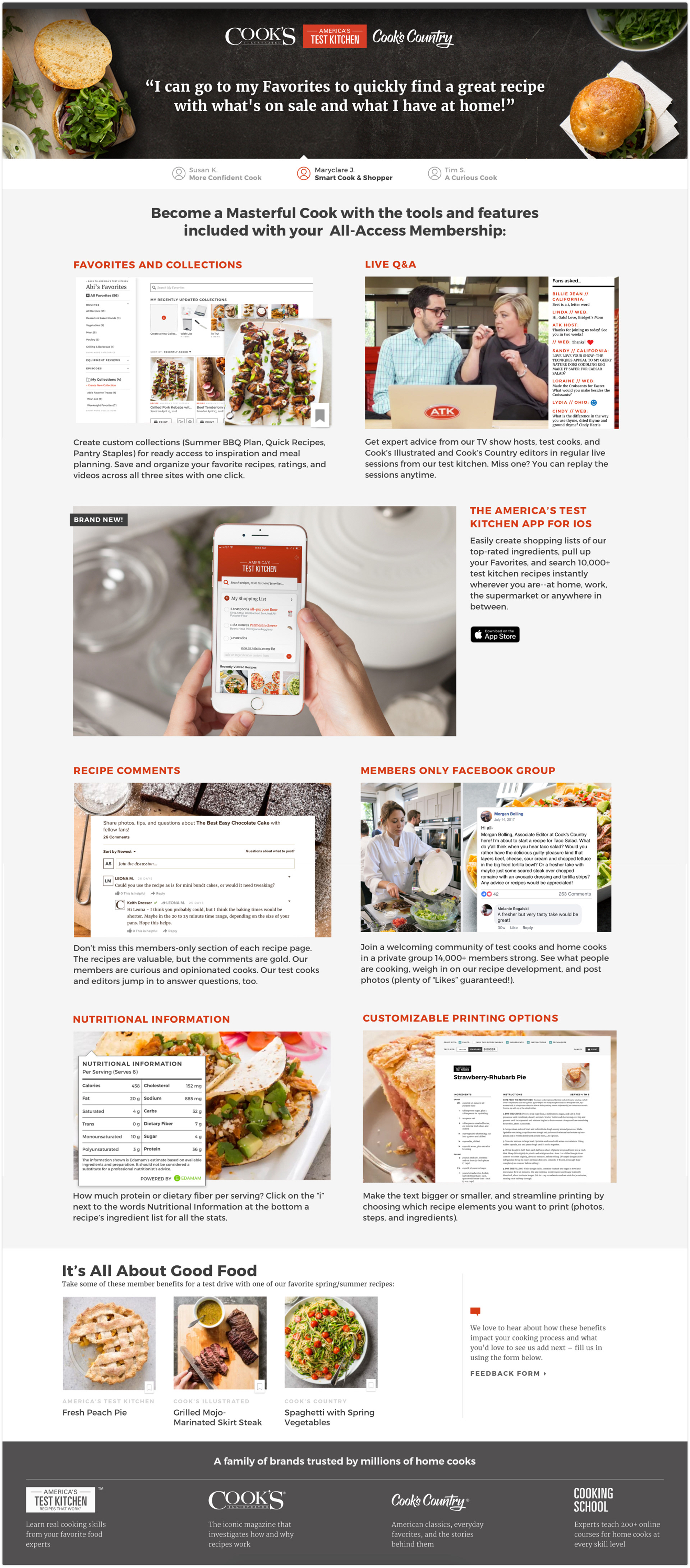
To spark excitement for someone’s new membership, I designed an onboarding page to show a new user what all they can do on our sites beyond looking at recipes. This identifies points of interaction they might now yet know about, with links to take them directly into these tools.

UX Partner: Kate Tetreault